Data science is quickly evolving to be one of the hottest fields in the technology industry. With rapid advancements in computational performance that now allow for the analysis of massive datasets, we can uncover patterns and insights about user behavior and world trends to an unprecedented extent.

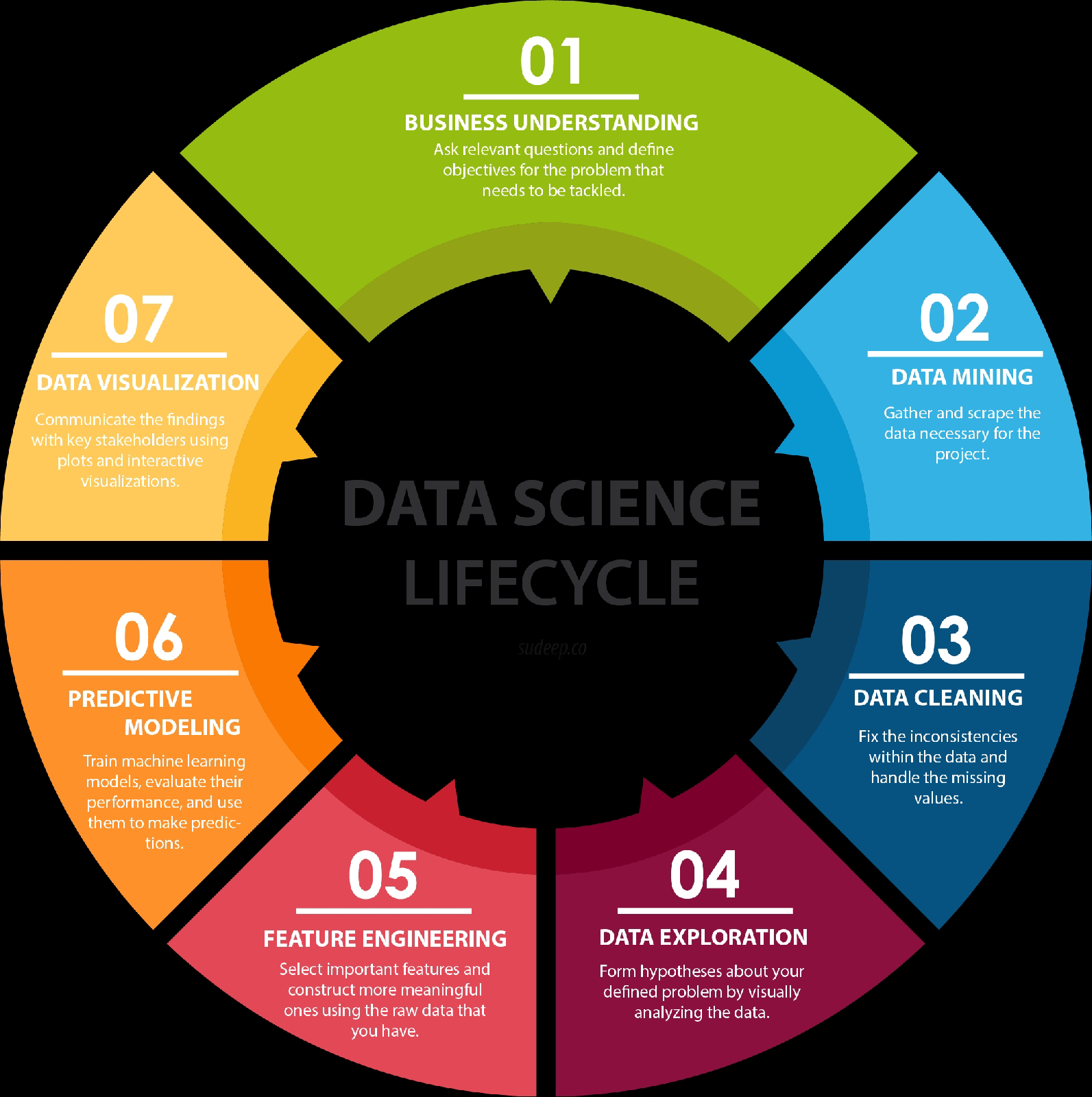
With the influx of buzzwords in the field of data science and relevant fields, a common question I’ve heard from friends is “Data science sounds pretty cool - how do I get started?” And so what started out as an attempt to explain it to a friend who wanted to get started with Kaggle projects has culminated in this post. I’ll give a brief overview of the seven steps that make up a data science lifecycle - business understanding, data mining, data cleaning, data exploration, feature engineering, predictive modeling, and data visualization. For each step, I will also provide some resources that I’ve found to be useful in my experience.
As a disclaimer, there are countless interpretations to the lifecycle (and to what data science even is), and this is the understanding that I have built up through my reading and experience so far. Data science is a quickly evolving field, and its terminology is rapidly evolving with it. If there’s something that you strongly disagree with, I’d love to hear about it!
1. Business Understanding
The data scientists in the room are the people who keep asking the why’s. They’re the people who want to ensure that every decision made in the company is supported by concrete data, and that it is guaranteed (with a high probability) to achieve results. Before you can even start on a data science project, it is critical that you understand the problem you are trying to solve.
According to Microsoft Azure’s blog, we typically use data science to answer five types of questions:
- How much or how many? (regression)
- Which category? (classification)
- Which group? (clustering)
- Is this weird? (anomaly detection)
- Which option should be taken? (recommendation)
In this stage, you should also be identifying the central objectives of your project by identifying the variables that need to be predicted. If it’s a regression, it could be something like a sales forecast. If it’s a clustering, it could be a customer profile. Understanding the power of data and how you can utilize it to derive results for your business by asking the right questions is more of an art than a science, and doing this well comes with a lot of experience. One shortcut to gaining this experience is to read what other people have to say about the topic, which is why I’m going to suggest a bunch of books to get started.
2. Data Mining
Now that you’ve defined the objectives of your project, it’s time to start gathering the data. Data mining is the process of gathering your data from different sources. Some people tend to group data retrieval and cleaning together, but each of these processes is such a substantial step that I’ve decided to break them apart. At this stage, some of the questions worth considering are - what data do I need for my project? Where does it live? How can I obtain it? What is the most efficient way to store and access all of it?
If all the data necessary for the project is packaged and handed to you, you’ve won the lottery. More often than not, finding the right data takes both time and effort. If the data lives in databases, your job is relatively simple - you can query the relevant data using SQL queries, or manipulate it using a dataframe tool like Pandas. However, if your data doesn’t actually exist in a dataset, you’ll need to scrape it. Beautiful Soup is a popular library used to scrape web pages for data. If you’re working with a mobile app and want to track user engagement and interactions, there are countless tools that can be integrated within the app so that you can start getting valuable data from customers. Google Analytics, for example, allows you to define custom events within the app which can help you understand how your users behave and collect the corresponding data.
3. Data Cleaning
Now that you’ve got all of your data, we move on to the most time-consuming step of all - cleaning and preparing the data. This is especially true in big data projects, which often involve terabytes of data to work with. According to interviews with data scientists, this process (also referred to as ‘data janitor work’) can often take 50 to 80 percent of their time. So what exactly does it entail, and why does it take so long?
The reason why this is such a time consuming process is simply because there are so many possible scenarios that could necessitate cleaning. For instance, the data could also have inconsistencies within the same column, meaning that some rows could be labelled 0 or 1, and others could be labelled no or yes. The data types could also be inconsistent - some of the 0s might integers, whereas some of them could be strings. If we’re dealing with a categorical data type with multiple categories, some of the categories could be misspelled or have different cases, such as having categories for both male and Male. This is just a subset of examples where you can see inconsistencies, and it’s important to catch and fix them in this stage.
One of the steps that is often forgotten in this stage, causing a lot of problems later on, is the presence of missing data. Missing data can throw a lot of errors in the model creation and training. One option is to either ignore the instances which have any missing values. Depending on your dataset, this could be unrealistic if you have a lot of missing data. Another common approach is to use something called average imputation, which replaces missing values with the average of all the other instances. This is not always recommended because it can reduce the variability of your data, but in some cases it makes sense.
4. Data Exploration
Now that you’ve got a sparkling clean set of data, you’re ready to finally get started in your analysis. The data exploration stage is like the brainstorming of data analysis. This is where you understand the patterns and bias in your data. It could involve pulling up and analyzing a random subset of the data using Pandas, plotting a histogram or distribution curve to see the general trend, or even creating an interactive visualization that lets you dive down into each data point and explore the story behind the outliers.
Using all of this information, you start to form hypotheses about your data and the problem you are tackling. If you were predicting student scores for example, you could try visualizing the relationship between scores and sleep. If you were predicting real estate prices, you could perhaps plot the prices as a heat map on a spatial plot to see if you can catch any trends.
5. Feature Engineering
In machine learning, a feature is a measurable property or attribute of a phenomenon being observed. If we were predicting the scores of a student, a possible feature is the amount of sleep they get. In more complex prediction tasks such as character recognition, features could be histograms counting the number of black pixels.
According to Andrew Ng, one of the top experts in the fields of machine learning and deep learning, “Coming up with features is difficult, time-consuming, requires expert knowledge. ‘Applied machine learning’ is basically feature engineering.” Feature engineering is the process of using domain knowledge to transform your raw data into informative features that represent the business problem you are trying to solve. This stage will directly influence the accuracy of the predictive model you construct in the next stage.
We typically perform two types of tasks in feature engineering - feature selection and construction.
Feature selection is the process of cutting down the features that add more noise than information. This is typically done to avoid the curse of dimensionality, which refers to the increased complexity that arises from high-dimensional spaces (i.e. way too many features). I won’t go too much into detail here because this topic can be pretty heavy, but we typically use filter methods (apply statistical measure to assign scoring to each feature), wrapper methods (frame the selection of features as a search problem and use a heuristic to perform the search) or embedded methods (use machine learning to figure out which features contribute best to the accuracy).
Feature construction involves creating new features from the ones that you already have (and possibly ditching the old ones). An example of when you might want to do this is when you have a continuous variable, but your domain knowledge informs you that you only really need an indicator variable based on a known threshold. For example, if you have a feature for age, but your model only cares about if a person is an adult or minor, you could threshold it at 18, and assign different categories to instances above and below that threshold. You could also merge multiple features to make them more informative by taking their sum, difference or product. For example, if you were predicting student scores and had features for the number of hours of sleep on each night, you might want to create a feature that denoted the average sleep that the student had instead.
6. Predictive Modeling
Predictive modeling is where the machine learning finally comes into your data science project. I use the term predictive modeling because I think a good project is not one that just trains a model and obsesses over the accuracy, but also uses comprehensive statistical methods and tests to ensure that the outcomes from the model actually make sense and are significant. Based on the questions you asked in the business understanding stage, this is where you decide which model to pick for your problem. This is never an easy decision, and there is no single right answer. The model (or models, and you should always be testing several) that you end up training will be dependent on the size, type and quality of your data, how much time and computational resources you are willing to invest, and the type of output you intend to derive. There are a couple of different cheat sheets available online which have a flowchart that helps you decide the right algorithm based on the type of classification or regression problem you are trying to solve. The two that I really like are the Microsoft Azure Cheat Sheet and SAS Cheat Sheet.
Once you’ve trained your model, it is critical that you evaluate its success. A process called k-fold cross validation is commonly used to measure the accuracy of a model. It involves separating the dataset into k equally sized groups of instances, training on all the groups except one, and repeating the process with different groups left out. This allows the model to be trained on all the data instead of using a typical train-test split.
For classification models, we often test accuracy using PCC (percent correct classification), along with a confusion matrix which breaks down the errors into false positives and false negatives. Plots such as as ROC curves, which is the true positive rate plotted against the false positive rate, are also used to benchmark the success of a model. For a regression model, the common metrics include the coefficient of determination (which gives information about the goodness of fit of a model), mean squared error (MSE), and average absolute error.
7. Data Visualization
Data visualization is a tricky field, mostly because it seems simple but it could possibly be one of the hardest things to do well. That’s because data viz combines the fields of communication, psychology, statistics, and art, with an ultimate goal of communicating the data in a simple yet effective and visually pleasing way. Once you’ve derived the intended insights from your model, you have to represent them in way that the different key stakeholders in the project can understand.
Again, this is a topic that could be a blog post on its own, so instead of diving deeper into the field of data visualization, I will give a couple of starting points. I personally love working through the analysis and visualization pipeline on an interactive Python notebook like Jupyter, in which I can have my code and visualizations side by side, allowing for rapid iteration with libraries like Seaborn and Bokeh. Tools like Tableau and Plotly make it really easy to drag-and-drop your data into a visualization and manipulate it to get more complex visualizations. If you’re building an interactive visualization for the web, there is no better starting point than D3.js.
8. Business Understanding
Phew. Now that you’ve gone through the entire lifecycle, it’s time to go back to the drawing board. Remember, this is a cycle, and so it’s an iterative process. This is where you evaluate how the success of your model relates to your original business understanding. Does it tackle the problems identified? Does the analysis yield any tangible solutions? If you encountered any new insights during the first iteration of the lifecycle (and I assure you that you will), you can now infuse that knowledge into the next iteration to generate even more powerful insights, and unleash the power of data to derive phenomenal results for your business or project.
If you think this helped your understanding of what a data science lifecycle is, feel free to share it with someone you think might benefit from reading it. I think that data science is a really exciting field that has an immense potential to revolutionize the way we make decisions and uncover insights that were previously hidden, and I strongly believe that speaking the language of data is a necessary skill in today’s workplace regardless of what field you’re in. If you have any thoughts on this, or have any links or resources that I can add to this post, contact me on krantigaurav@gmail.com